Candlesticks charts- Reading
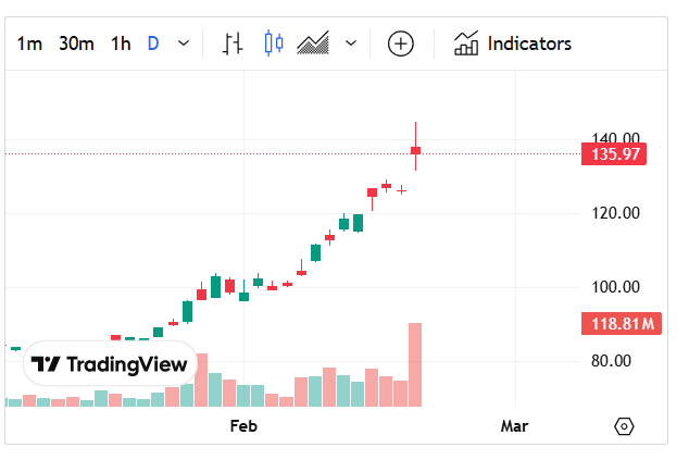
This is a candlestick chart from TradingView, commonly used in stock, forex, and cryptocurrency trading. It provides visual information about price movements over a specific period. Here’s how to read it:
1. Understanding the Candlesticks
Each candlestick represents a specific time frame (e.g., 1 minute, 1 hour, 1 day, etc.), as indicated at the top (this chart appears to be set to D or “Daily”).
- Green (Bullish) Candle: The closing price is higher than the opening price (price increased).
- Red (Bearish) Candle: The closing price is lower than the opening price (price decreased).
- Wicks (Shadows): Thin lines above and below the candlestick body represent the highest and lowest prices reached during the time period.
2. Interpreting the Chart
- The x-axis represents time (dates), moving from left to right.
- The y-axis represents the price of the asset.
- The volume bars at the bottom show the number of shares or contracts traded during the period. Green bars indicate high buying interest, while red bars indicate selling pressure.
3. Recognizing Trends
- Uptrend (Bullish Movement): A series of higher highs and higher lows (as seen in your chart).
- Downtrend (Bearish Movement): A series of lower highs and lower lows.
- Sideways (Consolidation): When the price moves within a range without clear direction.
4. Key Observations from Your Chart
- The stock has been in a strong uptrend since early February.
- There is a large red candle at the top, which could indicate profit-taking or a potential reversal.
- A high volume spike on the last candle suggests strong activity, which could either mean a trend continuation or a reversal.
5. Next Steps for Analysis
- Check for support and resistance levels.
- Use indicators like Moving Averages, RSI, or MACD for confirmation.
- Watch how the price reacts after the red candle—does it recover or continue down?